
The Art of Definitions
I delineate definitions into two types: (1) ones that explain a term you don’t understand and (2) ones that specify a term you mostly understand. I once took a philosophy class where we debated different definitions of art. Most of us kinda know what art is: creative works like paintings and symphonies. We also see tons of edge cases where a formal definition would help. Are those weird abstract pieces art? Are video games art? Are popcorn movies art? Still, all these questions begin from a common understanding of the term “art.” No one thinks “art? Isn’t that some bug native to Australia?” Everyone sorta knows what art is, but we find it difficult to craft a type (2) definition.
These definitions rarely help people with no previous exposure to the topic. I’ve discussed this in the context of machine learning, with definitions that illuminate nothing to those unfamiliar with the topic. The same applies to the phrase “statistically significant” and related terms like “p-value” and “Z-score.” Here’s a definition of “p-value” from Wikipedia:
In null-hypothesis significance testing, the p-value is the probability of obtaining test results at least as extreme as the result actually observed, under the assumption that the null hypothesis is correct. A very small p-value means that such an extreme observed outcome would be very unlikely under the null hypothesis.
This probably helps if you already kinda know what a p-value is. Given how I’ve seen these terms used, however, I must conclude that most people don’t really understand them. For instance, where I’ve presented results like this at work:
Sample A: mean proportion of 0.6; sample size of 150,000
Sample B: mean proportion of 0.3; sample size of 150,000
I’ll conclude that sample A’s proportion exceeds1 sample B’s, and someone will ask “but is it statistically significant?” I’m not ridiculing anyone, by the way. It’s fine for people to focus on areas of the business that don’t require statistical expertise. I just think it shows that the terminology has penetrated the mainstream, but the meaning of this terminology has not.
I remember encountering this during an interview about a year ago. The hiring manager asked one of those “tell me about a time…” questions, and I responded with a business problem that I discovered and addressed with data. After my canned story, he asked, “but did you do a t-test for statistical significance?” I found the question a bit puzzling and I responded by saying that the results were obvious enough that I didn’t need to. He looked at me like I was a moron. Well, Mr. hiring manager, I think you’re the moron.
Yes, by the way, the difference between the proportion in sample A and the proportion in sample B is statistically significant enough for most use cases. By the end of this article, I hope you understand what that means.
The Formula
I’ll start with the formula for the t-statistic:
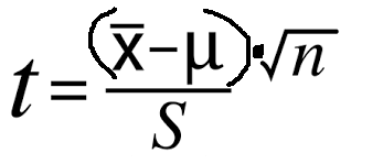
I’ve rewritten it a bit to remove the bizarre fractions-within-fractions orthography. A t-statistics further away from zero corresponds to a higher level of statistical significance. When I say “further away from zero,” I’m equivocating high positive and negative values; t= 40 and t=-40 are both highly statistically significant. For the remainder of this article, I’ll refer to values further away from zero as “large” and those closer to zero as “small.” You can also keep in mind that large t-values correspond to low p-values and vice-versa.
For the reasons mentioned above, I’m going to skip the technical definitions and instead focus on intuition. If that formula spits out a larger number, we have a more statistically significant result. If it spits out a small one, we have a less statistically significant result. Unfortunately, many glaze their eyes over math formulas. As a math tutor, I remember students plugging terms into a calculator without any intuition of what the formula meant. We shouldn’t just accept formulas at face value. Formulas tell a story. That fraction is basically Star Wars.
Story Time
Imagine that you have a bin of balls, and you are asked to determine whether the average ball weighs 100 grams. You will grab the balls at random, so you you’re not more likely to grab heavier or lighter ones. Of the ones you take, what would make more certain that the balls don’t average 100 grams? The formula above answers this question.
At the top of the fraction, we see (X-bar - Mu). For typographical simplicity, I’ll write the former as X and the latter as M. X refers to the average weight of our sampled balls while M refers to the expected average that we’re comparing against. This sits at the top of the fraction, so higher values will lead to larger t-statistic values. In this example, our M is 100, since we’re trying to tell if the balls weigh 100 grams. Values of X further from 100 will increase the t-statistic, thereby increasing statistical significance. This should make intuitive sense. If you sampled 30 balls and they averaged 170 grams (or, for that matter, 30 grams), you’d be pretty sure these balls don’t weigh 100 grams. On the other hand, you feel less certain if the balls averaged 101 or 99.
I’ll skip √n and head to S, or standard deviation. Since this lays at the bottom of the fraction, higher values of S will make the t-statistic smaller. In other words, a higher standard deviation means less certainty. Again, let’s think of the balls. In scenario one, you take 20 balls from the bin and the results look like this:
110; 109; 111; 109; 108; 110; 111; etc
In scenario two, the results look like this:
160; 60; 200; 2; 173; 50; etc.
I’m not going to list all 20 samples for each scenario, but you can see what I’m going for. Let’s pretend the mean weight for both scenarios is 110 grams. We’re going to be more comfortable concluding the balls don’t average 100 grams in the first case since you can see them starting to hover around 110. In the higher-S second scenario, one will find it difficult to include much of anything about the average weight of the balls. That’s what the formula shows us.
Now, I’ll return to the top of the fraction. Again, since we’re on top, higher values make the t-statistic larger. However, our lonely n, or sample size, stands inside a square root. I’ve seen many students squeal at these, but this too tells a story.
Considers the numbers 1, 4, and 9. The difference between 4 and 1 is 3. The difference between 9 and 4 is 5. Thus, the gap between 4 and 9 is larger than the gap between 1 and 4. Now let’s take the square root of these three numbers: 1 stays at 1, 4 becomes 2, and 9 becomes 3. The difference between 9 and 4 was bigger than the difference between 4 and 1, but the difference between √9 and √4 is the same as the difference between √4 and √1. Square roots, in other words, squeeze the number line together.
In the material world, this indicates a diminishing return to sample size. Heading back to the ball bin, imagine that you see an average of 103 grams after pulling 40 balls. You’ll be a lot more certain of this result if you pull another 500 and it stays at 103 grams. At some point, though, the additional samples won’t provide much additional information. If we’ve pulled 100,000 balls, bumping that figure up to 100, 500 won’t tell us much.
In short, the formula tells us we’re more certain that the balls don’t weigh 100 grams if:
Our sampled average is further from 100 (in either direction)
The dispersion within our sample is smaller (e.g. we’re more certain if we see 110; 109; 111 than if we see 110; 160; 70)
The sample size is larger
However, we see diminishing returns to sample size. Going from 100 to 200 is a lot more valuable than going from 500,000 to 500,100
All that comes from the formula! I apologize if this seems a bit obvious, but I have enough experience with college students, industry professionals, and lay people who look at formulas as if they’re alien runes. Everything in that formula tells an intuitive story.
I want to add one additional detail, however. When I introduced the topic of statistical significance, I did so via a test of proportions. Here’s an example where the same formula applies: we’re asked to see if 70% of the balls weigh more than 100 grams. Let me run down what that would look like:
M = 0.7, the value we’re testing against
X would be the percent of the sampled balls that weighed more than 100 grams
n is still sample size
S, however, is easier to calculate in t-tests of proportions: it’s just M * (1-M).
In this example, S equals 0.7 * 0.3, or 0.21.
These calculations grow a bit more complex when we’re comparing two different samples, but the intuition remains the same
Do We Need More Sample?
The previous section discussed diminishing returns to sample size. Why, then, do I often inform my stakeholders that I need a larger sample? While that formula tells a captivating story, it doesn’t tell the whole story. In business contexts, I rarely suffer from a lack of sample size. Rather, I suffer from a lack of sample representativeness.
For the ball example above, our samples only provide meaningful information if they represent the full population of balls. If they don't, no sample size will save us. Imagine that I want to estimate the average height of an American male, and I sample NCAA basketball players. I could sample 30; 300; or 3,000 and none of those samples would tell me anything about the height of the average man. In other instances, however, we can obtain a more representative sample by obtaining a larger one.
Let's say I want to survey a college campus to see if the students prefer ube or key lime pie. I know that the student body consists of about 60% purple people (who tend to prefer ube) and 40% green ones (who tend to prefer key lime). Under ideal conditions, I'd survey the entire student body. That's probably not feasible, so might resort to standing in front of a couple of buildings and surveying whoever walks by. Statistics textbooks call this a convenience sample, but, in practice, it's often the only kind of sample we have.
I stand outside the buildings on the east side of campus and ask students about their pie preferences. My sample comes through indicating that 90% of students prefer ube. Unfortunately, I also noticed that 95% of surveyed students were purple people, meaning my survey fails to represent the student body. For whatever reason, the purple people tend to choose majors on the east side of campus.
To retrieve a more representative sample, I would also need to interview people from the buildings on the west side of the campus. This would provide a larger n, sure, but that's not the main advantage. Rather, adding more green people to my sample will provide a more representative look at the student body. The best results would come from a stratified random sample, where I randomly sample the green and purple people in a way that represents the college's 60-40 split. Again though, in practice, it might be hard to obtain this data in a truly random manner.
Still, the pie survey involves easily identifiable groups. If I realize my survey under-sampled green people, I could re-weigh my results to match the student body. Unfortunately, no intuitive weighting process exists for unobservable attributes. Imagine that, for example, I want to test the effect of tutoring on math scores. I open a tutoring center and see that the students who received tutoring scored better than the ones that didn't. That's still not enough information to conclude that the tutoring works. It's plausible that motivated students were more likely to opt for tutoring while the less motivated ones were more likely to skip it. As a result, the tutoring might have gone to students who would have performed better even in their absence. Unlike the pie example, I can't look at my results and know which ones were motivated and which ones were not. I could also apply some more complicated econometric methodology. Those methods pose their own problems, however, and I’ll leave those to a separate article.
A More Detailed Example
Say you're an analyst for a site that sells office supplies. You want to run an experiment with a new UI, and see if it encourages more product views per session. The best experiment would be an A/B test: half the users see the new UI and the other half see the old one. If this isn’t feasible, however, we’re just going to have to change the website for a set amount of time and see how user behavior changes. If the website receives thousands of sessions each day, a single day of data may suffice for obtaining a high t-statistic. We might not need any more days if we just want to obtain a highly statistically significant result. Yet, I would still want to run a test like this for a couple of weeks to receive a more representative sample.
If the test runs for a single day, or even just a few days, we run into day-of-week seasonality. The users who visit on a Monday or Tuesday may differ from the ones who view the site on other days. As such, our experiment might not find a representative sample.
Okay, so maybe we run it for the whole week. That still might cause issues. For example, maybe we notice that, due to the prevalence of business customers, we receive a bulk of sessions at the beginning of each financial quarter. If our one-week test runs on the first week of Q2, we might still face the problem of an unrepresentative sample.
Fine, now let’s look at our historical data and find which weeks look more normal and pick one of those. Are we good now? Well, maybe, but here’s where context matters more than formulas. Imagine that we run this experiment and, at the same time, one of our competitors announces a sale. If that occurs, it will be impossible to tell whether the change in user behavior was driven by the new UI or by the competitor’s sale. Alternatively, a major news story could drive people to our site during the test week. Maybe some search engines prioritized or deprioritized us during that time. Maybe we ran compelling email campaigns the week of the test and ran crappy ones the week before.
In any of these scenarios, an analyst cannot disentangle the impact of the extenuating circumstance from the impact of the new UI. Running the test for multiple weeks can alleviate some of these issues. Over a longer period of time, in other words, random crap will balance itself out. The sample will contain some days with competitor sales and some without them. It will contain some days with great email campaigns and some days with mediocre ones. The test will therefore occur among a more representative sample of sessions.
Executive Summary
In true business style, I will conclude with a bulleted list.
We often measure statistical significance via the t-statistic. The t-statistic tells us that our result is more statistically significant if:
The average of our sampled values is far from the hypothesized value.
The sampled values are closer together
We have a larger sample
However, there are diminishing returns to sample size
This only applies if the sample represents the broader population
The best way to achieve a representative sample is by obtaining a random sample
Though a large sample does not necessarily imply a more representative one, we can often make our sample more representative by increasing its scope (and therefore size)
Oh, I forgot, I need to emphasize one more point. There’s no value of the t-statistic (or p-value) where a result becomes “statistically significant.” Statistical significance is continuous. A t-value of 20 is more statistically significant than a t-value of 4, which is more statistically significant than a t-value of 0.008. We often choose a cutoff of p=0.05 (roughly a t-value of 2), but there’s nothing special happens at 0.05. You’re allowed to make decisions based on a result with a t-statistic of 1.5. You’re allowed to dismiss ones with a t-statistic of 2.2. If someone thinks there’s one discrete spot where results become “statistically significant,” they probably don’t understand the concept. Yes, guy who interviewed me last year, I’m talking about you.
I try to avoid filling my essays with “to be” verbs: is, are, were, etc. When one says that A is bigger than B, we have the word “exceed.” Is there no anonym to “exceed?” If not, I vote we all start saying “inceed” until it catches on.
This was illuminating. I love the concept of a formula as a story. That’s a PERFECT way of describing it for someone who is not intuitively math minded. From now on I can say “I don’t understand the story this formula is telling.” I’ll bet you were a great math tutor.
Great explainer! Agreed with Erin: The description of a formula as a story is illuminating. It was certainly not how I was taught to think about it - I'd just be plugging the numbers into the calculator.