I know, I know, no one wants to read about the election. Likewise, I don’t want to write about it. However, I do like writing about statistics. Before getting sidetracked into historical linguistics, I intended to make this into a “stats and data for dummies” blog. In other words, there will be no politics in this article or its comment section. Instead, I want to talk about randomness.
People, even smart ones, often lack statistical intuition. After all, much of what one might consider “basic statistics” arrived pretty recently. In primary school, you learned about geometrical and algebraic theorems from Ancient Greece and the Golden Age of Islam. In a statistics class, you’ll learn about the correlation coefficient from 1896.
That’s where the election comes in. If you’ve been following the polls, you’ll notice that tons of them show a close race. In fact, the race seems a bit too close. From Nate Silver:
Take, for example, this afternoon’s polling release from the British firm Redfield & Wilton. They polled all seven of the core battleground states. And in all seven, Kamala Harris and Donald Trump each received between 47 and 48 percent of the vote:
Isn’t this a little convenient? Whatever happens, Redfield & Wilton — not a firm with a well-established reputation in the US — will be able to throw up their hands and say “well, we projected a tie, so don’t blame us!”.
The article then goes on to explain things like standard deviations and margins of errors. I tutored math for 5 years and worked as a data analyst for 6. In other words, I’ve been explaining numbers for about 11 years straight. I can safely say that, once the article drops a term like “margin of error,” most readers will tune out.
Instead, let’s ask a simple question: if the race is super close, shouldn’t we expect most polls to be? This can be hard to intuit, and even harder to answer through probability distributions and formulas. Let’s do a simulation instead.
Per the same article:
Now granted, our forecast is close too. But it’s based on polling averages: dozens of polls have been released in each of these states over the past month. That greatly increases the sample size. Collectively, they’ve surveyed about 230,000 voters.
By contrast, the median sample size in individual polls in these states is 800 voters. In a 49-49 race in a poll of 800 people
Given a total of 230,000 voters with an average of 800 per poll, Silver has aggregated about 288 polls. For our simulation, I’ll round that up to 300. Then I’ll multiply it by 10 because thousands are cooler than hundreds. With that in mind, here is the scope of the simulation.
I will start a population perfectly split between candidate A and candidate B. There are no third-party or “None of These Candidates” options on the ballot
I will simulate 3,000 random draws from this population. There will be 800 respondents in each draw
Within each draw, I will calculate the percent of the vote total given to candidates A and B. For example, if candidate A receives 500 responses, they will be awarded 62.5% of the vote for that draw.
I will then calculate the difference between candidates A and B, and round each number. If candidate A gets 53% and candidate B gets 47%, the difference is 6.
Differences will be rounded. A difference of 2.6 counts as a 3, while a difference of 2.4 counts as a 2.
I will take the absolute value of each difference. a 48-52 result counts the same as a 52-48 one.
Now, here’s where you come in. What do you think the result of this simulation will be? Please comment before looking at the results. I want you to answer the following question
What percent of the 3,000 random draws will show a 0 or 1-point difference?
What percent will show a 2-3 point difference?
Under/over: 9.5 polls show a gap of 10 or more
My code is pasted below for transparency.
from random import choices, seed
import pandas as pd
import numpy as np
import seaborn as sns
seed(0)
NUM_RUNS = 3000
NUM_RESP = 800

colors = ['A','B']
result_li = []
for x in range(NUM_RUNS):
    temp = choices(colors, k=NUM_RESP)
    counter = 0
    for item in temp:
        if item == 'A':
            counter = counter + 1
    result_li.append(counter/NUM_RESP)

gap_li = []
for res in result_li:
    gap_li.append(res + res -1)

gap_chart = []
for gap in gap_li:
    gap_chart.append(np.round(gap * 100,0))

abs_gap_chart = [abs(x) for x in gap_chart]

np.bincount(abs_gap_chart)

# For the graph below
sns.histplot(gap_chart)
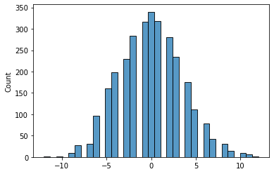
Did you put your guess in the comments? First, a visual.
And, now, the answers:
32% show a gap of 0 or 1 point
34% show a 2-3 point difference
OVER. 11 polls show a 10-point gap, 6 show 11 points, and 2 show 12 points
To answer the subtitle: no, they couldn’t really be this close. The pollsters are keeping a lot of their results in the file drawer.


